Role:
UX/UI Designer,
Year:
2022
Platform:
Mobile
How do roommates find each other?
Over one quarter of young Americans live with a roommate. SoulRoomMate stands out against existing roommate-finding sites as the first app to match potential roommates — by assessing users and connecting the most compatible pairs, we can encourage healthy relationships and harmonious home lives.
This is a Springboard Design Project. As sole designer, I built this app from the ground up: from user research and interviews to designing and testing.
Research & Architecture
Compatibility
similar living habits
social battery
shared moral values
shared traits
Conclusions
5 User Interviews • 2 Empathy Maps 2 Personas • 3 Journey Maps
Desired Relationships
become close friends
friendly but not close
civil relationship
Potential Features
overview of traits
user-written bio
description of living space
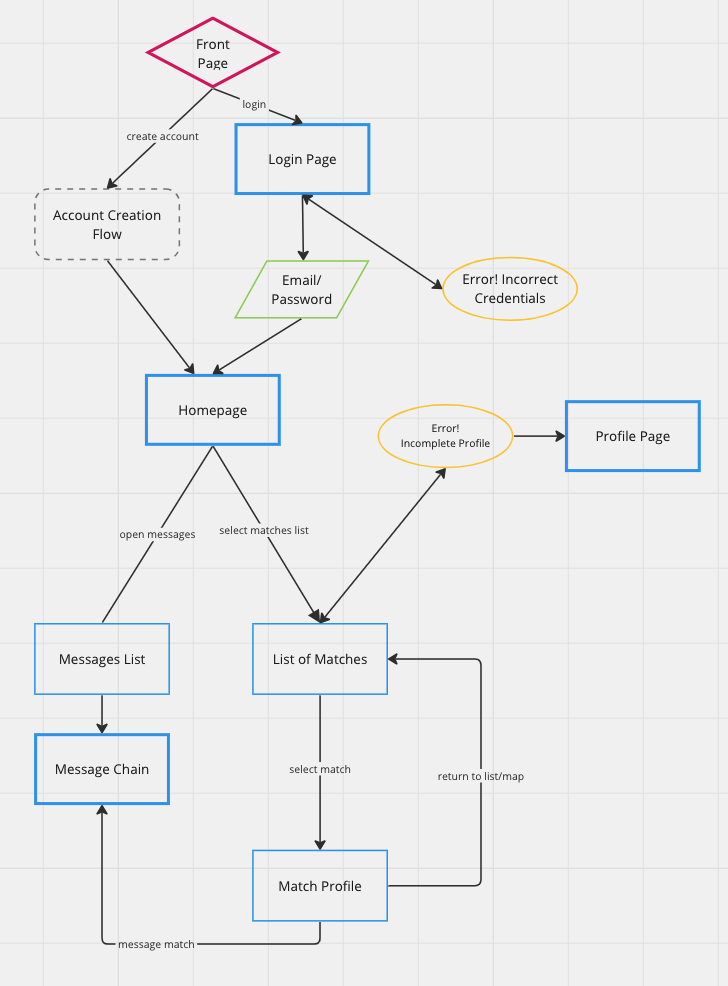
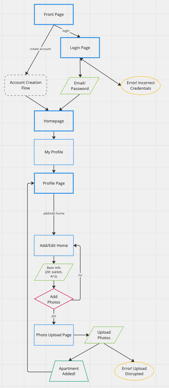
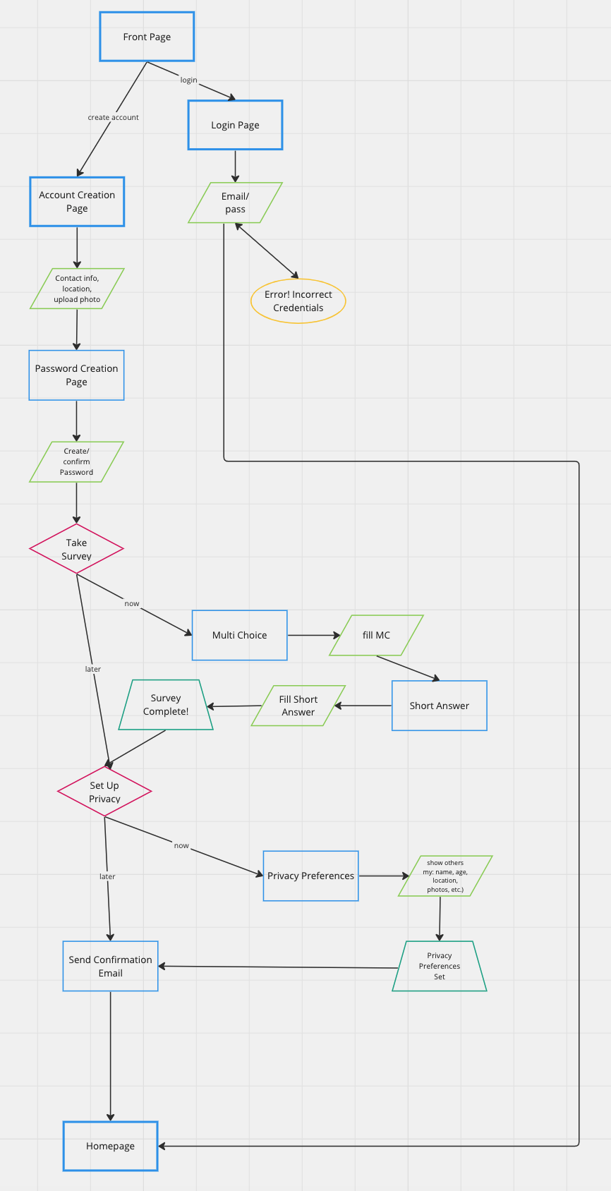
Initial user interviews led to the creation of three flows: one for setting up an account with all necessary information, one for finding a potential roommate after account creation, and one for adding a residence to an account for other users to see. I aimed to create as few screens as possible to complete each task, to increase retention, while still creating avenues for users to share all necessary information.

Flow: Find a Roommate

Flow: Add Residence

Flow: Create Account
Sketches & Geurrilla Testing
I focused first on sketches of key screens, including login/account creation, a homepage, a list of matches, profile, and chat screens. These were then fleshed out to include entire flows that were consistent with the key screen designs. One goal of the sketches was to find a happy medium between typical roommate websites and matching apps (such as dating or friendship apps) that would form a recognizable platform that included all relevant information without being too verbose or overstimulating. Cards allow users to move through potential roommates and sections of their profile without moving to a new page.
Geurrilla User Testing
Three participants ages 23-34
Goals
test order of tasks in each pathway
test structure of several screens
determine any pain or potential drop points
Findings
pathways are straightforward
use of heart icon is confusing
redesign of home screen
integrate privacy into account creation
Next Steps
redesign of homepage and ‘add home’ screen
change likes to swipe-based
separate screens for adding and editing home
Wireflows & Design Systems
Wireflows for each user flow established exactly how many screens would be necessary to achieve all user goals. A second round of testing found that the flows were easy to follow and could be completed quickly. Feedback incorporated into the final design included the a limit on written short answer and bio length, what questions are most important in account creation and shown on profiles, and the minimum and maximum number of photos to display a residence. Testing participants were also asked about the design system colors and images. Feedback described the color palette as ‘calming',’ ‘professional,’ and ‘cheerful.’
Final Product & Conclusions
Final prototype is intuitive and easy to use
Simple, calming colors and clear steps move users through app
Automated matching system would be essential for full use of app
Potential for monetization through subscription, housing matching service, or ads
All three user flows can be seen on Figma.


