

The Challenge
RMG is a California-based developer that specializes in building affordable housing in conjunction with local charities and faith-based organizations. After outgrowing their previous website, I was brought on to design and build an updated, WCAG-compliant web and mobile site.
My Role
• Sole Designer
• Website Audit
• Research and synthesis, personas and user journeys
• Sketches, wireframes, hi-fi prototypes
• Design system
• Build website using wordpress
The Challenge
RMG is a California-based developer that specializes in building affordable housing in conjunction with local charities and faith-based organizations. After outgrowing their previous website, I was brought on to design and build an updated, WCAG-compliant web and mobile site.
My Role
• Sole Designer
• Website Audit
• Research and synthesis, personas and empathy maps
• Sketches, wireframes, hi-fi prototypes
• Style Book
• Build website using wordpress
Audit, Research, and Synthesis
Audit, Research, and Synthesis
I began by performing an audit of the existing RMG website. I then created a report of points of potential improvement, focusing on information architecture and WCAG compliance. This was followed by company and competitor research. From this, I created two user personas representing the two most likely site visitors: potential partners, and private developers.
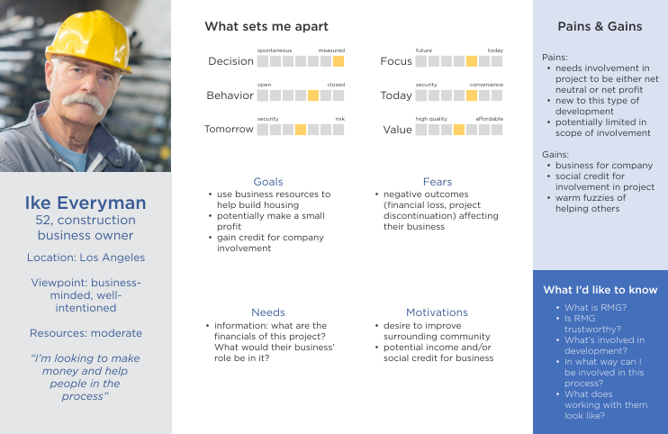
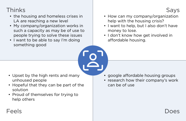


After presenting these and my audit to the leadership at RMG, we discussed project goals, website structure, and project timeline.
I began by performing an audit of the existing RMG website. I then created a report of points of potential improvement, focusing on information architecture and WCAG compliance. This was followed by company and competitor research. From this, I created two user personas representing the two most likely site visitors: potential partners, and private developers.
After presenting these and my audit to the leadership at RMG, we discussed project goals, website structure, and project timeline.
Synthesis and Sketching
Sketching and Information Architecture
Sketching and Information Architecture
The original site design had only two pages: a contact page, and a front page with everything else. I recommended splitting the content into multiple pages to make navigation easier and the information more digestible to users. Working with leadership, we decided on six pages. A seventh was later added to include RMG’s construction branch, TRG.


Compared to the original design, this new plan includes far fewer buttons, more images, and using negative space and color to create visual hierarchy and separate elements. The base content of several sections was carried over to the new design, but was restructured to create a smoother user flow. The president of RMG liked the concept of cards to display content, so they were incorporated where appropriate.
The original site design had only two pages: a contact page, and a front page with everything else. I recommended splitting the content into multiple pages to make navigation easier and the information more digestible to users. Working with leadership, we decided on six pages. A seventh was later added to include RMG’s construction branch, TRG.
Compared to the original design, this new plan includes far fewer buttons, more images, and using negative space and color to create visual hierarchy and separate elements. The base content of several sections was carried over to the new design, but was restructured to create a smoother user flow. The president of RMG liked the concept of cards to display content, so they were incorporated where appropriate.
Wireframes
Wireframes
With leadership’s approval of the sketches, I created wireframes of each page.
I also began creating a style book, which I provided to them at the end of this project. It included a color palette, fonts, buttons, icons, and any repeated elements. RMG is a professional, hi-tech, community-oriented company that values accessibility, so all aspects of the book were chosen with this in mind.
Hover over the image to scroll through each page.
With leadership’s approval of the sketches, I created wireframes of each page.
I also began creating a style book, which I provided to them at the end of this project. It included a color palette, fonts, buttons, icons, and any repeated elements. RMG is a professional, hi-tech, community-oriented company that values accessibility, so all aspects of the book were chosen with this in mind.
Hover over the image to scroll through each page.
Mockups and Site Building
Mockups and Site Building
High-fidelity mockups brought everything together. To better keep track of what images, logos, and icons they needed to provide, RMG leadership requested I keep empty image boxes in any space we didn’t have the exact image.
The final stage of the project was rebuilding the site using the website builder WordPress. At the request of leadership, a logo banner was added to the home page, and some formatting was changed.
Since completion of the project, RMG has altered some aspects of the new design.
Hover over the image to scroll through each page.